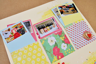
Back today to share a couple more layouts that I created using the Hip 2B Square March Hip Kit. The design team was asked to use this Hip Sketch for one of our layouts...
Here's what I came up with...
For this layout, I had fun playing with mist & paint. I used the Mister Huey in Schoolhouse Red (again, on the Studio Calico wood veneer letters), AppleJack & Sunshine, plus some white acrylic paint. By dipping my paint brush directly in the Mister Huey Sunshine, I was able to create a golden wash in some areas of the background. With a touch of water added, it created an even softer glow.
Then rather than spraying the mist I unscrewed the top & just flicked ink on the page. (Be sure you're not wearing a white t-shirt & that you have your work space protected when you do this...trust me!) Since I don't have any of the white or cream Mister Huey, I added water to some white acrylic paint until I had a nice fluid paint & then flicked that on the background too. The thicker acrylic paint added some fun texture!
I have soooo many photos from January's winter CHA...so much inspiration there that I couldn't resist trying to capture all the eye candy to be had. I printed out some of my favorites. Still too many to use on one layout, so I decided to make library card pockets that could hold multiple pictures. Each pocket holds about eight tags. On each tag I can journal 'I Spy...' and a little bit about each picture.
Here's a picture of what these layouts look like together as a two-pager. (Sorry for the crooked-y shot, but you can get the idea.) I think I'll use this same idea for one of our summer adventures this year!
Wishing you a very happy & creative day...
xoBC


oh man alive....I have missed your creative talent!!! love these 2 los of total yummy cha stuff!! your paint and flicking of the mist techniques look awesome and I love that big circle punch. so fun!!! :)
ReplyDeleteFun layout, Bethany! Will you be at CHA Summer in Chicago?
ReplyDeleteLove how fun and bright this is!
ReplyDeleteI love this idea. It is great for incorporating tons of photos and it looks adorable. Thanks for sharing some amazing inspiration and ideas.
ReplyDeleteA fun, happy layout!! {sigh} CHA...I always say I'd be like - or even worse - than a kid in a candy store if I were to ever get to go to CHA!! :) Congrats on being featured on Moxie Fab today!
ReplyDelete